Samples
The Cal Lutheran identity is a collection of elements that create the look and feel of the entire brand experience. Our colors, typography, photography, graphic elements and voice all combine to create a strong, unique image. The way we use these elements can alter the perception of a given piece, making alumni and donor communications feel more reserved, for example, or helping current student, faculty and staff materials feel more expressive.
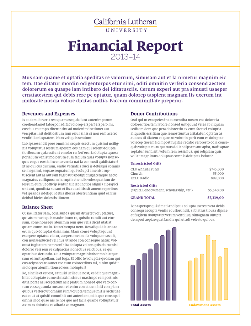
Financial Report
For successful reports, position papers, articles and other objective pieces, limit type and color choices, use white space, and incorporate the rule element. Here, information is presented simply, incorporating simple graphics and a few weights of the Milo typeface.
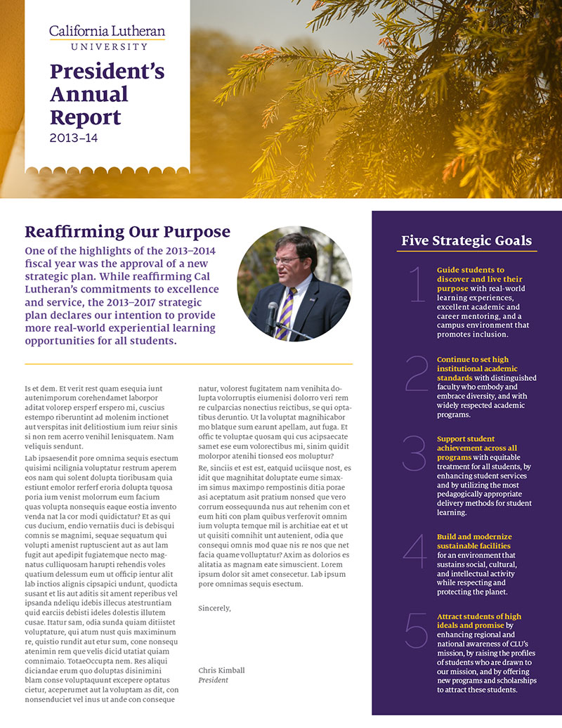
Annual Report
For signature editorial materials, distinct graphic elements like the arch pattern and brand photography can lend some energy to a piece and give it a branded look.
Brochure
Our core colors are one of the brand’s most recognizable assets, especially to legacy audiences such as alumni. Here, the color is the dominant element.

Ad
Using type as a photo cropping tool is an elegant way to add sophistication. Here it complements an inquisitive message, inviting readers to learn more.

Graduate Recruitment
The image and the message work together to tell a story in this master brand piece. Location-based photography helps establish a sense of place.

Undergraduate Recruitment
To communicate our open and energetic personality, the secondary palette and brand photography create a pattern in this example.

University Event
Special events can lean more heavily on the secondary palette and the full range of available typefaces to create a unique look that still feels like Cal Lutheran.

Student Event
Some pieces, especially those directed toward audiences already familiar with Cal Lutheran, can lean on the more expressive elements of the brand language for a distinct look.

Black and White
Color is great, but sometimes - because of medium, or budget or time constraints - it's not feasible to use. Here are some quick tips for how best to use the brand in black and white.

Just because the image is in black and white doesn't mean type can't still be set
on top of it. Make sure you maintain enough contrast for legibility, though.
Without color, establishing hierarchy through type is even more important. Note that
the headline has the largest point size, followed by the website, the session information
and then the body copy.
Placing a solid shape behind the important information helps call attention to it
when the rest of the text is set on white.
Use the rules to highlight and divide information, leading a viewer's eye through
the page.
Because the logo lacks the color to help call attention to it, try making it a little
bit larger than normal.